



- What is Skeleton Mammoth?
- Getting Started
- Usage
- Examples
- Notes and limitations
- Live Demo
- API
- Contributing
- License
- Contact information
Skeleton Mammoth is a CSS library for displaying skeleton loaders (also known as placeholders) on the elements of a page while the data is being loaded in the background. There is no JavaScript and no dependencies: you set a few classes, and the library draws the skeletons.
- Class based: apply the classes to the elements you want to see the skeleton on. No new components or structural changes are required.
- Adapts to your elements: the skeleton is drawn on the element itself, so it takes the size and the own
border-radiusof the element. - Configurable: animation, theme, opacity and border radius are set with one configuration attribute.
- Light and dark themes: follows the color scheme of the system, or forces
light/dark/ the color scheme of your page. - Animations:
wave,wave-reverse,pulseor none. Animations are turned off for the users who prefer reduced motion. - Text lines: draws the skeleton of a text as lines, for any number of lines, even if the element is still empty.
- Smooth appearance: the content can appear smoothly when the loading is finished (optional).
- Accessible: supports the reduced motion and the high contrast (forced colors) modes.
- Customizable: all colors and animation values are CSS variables.
- Lightweight: about 13.8 KB (1.9 KB gzipped), pure CSS, no dependencies.
Using NPM:
npm install skeleton-mammothUsing jsDelivr CDN:
<link rel="stylesheet" href="https://cdn.jsdelivr.net/npm/skeleton-mammoth@4/dist/skeleton-mammoth.min.css" />Note:
@4is the latest version of the major version 4. You can also use an exact version (for example,@4.0.0), or omit the version to always get the latest one.
The library uses modern CSS features (such as light-dark(), color-mix() and translate),
so it requires the following minimum browser versions: Chrome 123, Edge 123, Firefox 120, Safari 17.5.
In older browsers the skeleton is not displayed.
1. Import the library. Either within a scope of a specific component, or globally on the application level:
import 'skeleton-mammoth/dist/skeleton-mammoth.min.css';2. Set the sm-loading class to a parent element while the data is loading.
It can be any ancestor of the skeleton elements: a card, a list or the root of the page (even the body).
Remove the class when the data is loaded.
<div class="card sm-loading">
    <!-- Omitted pieces of code. -->
</div>
Note: The
sm-loadingclass is a switcher. Only while it is present, the child elements with thesm-item-primaryorsm-item-secondaryclasses display the skeleton.
3. Set the sm-item-primary or sm-item-secondary class to the elements you want to see the skeleton on.
Both display the same skeleton, only the color is different: the primary is darker, the secondary is lighter.
For example, the primary can be used for images and the secondary for the text.
<div class="card sm-loading">
    <div class="card__image sm-item-primary">
      <img src="photo.jpg" alt="Photo.">
    </div>
    <p class="card__title sm-item-secondary">Card title.</p>
</div>
Note: The skeleton can not be displayed on some elements, for example on
<img>. Wrap such an element into a<div>and set the class to the wrapper, as shown above. See Elements that can not have a skeleton.
That is all: the skeleton is displayed with the default settings.
To change the settings, pass a JSON string with the configuration object
as the data-sm-config attribute of the element with the sm-loading class.
All the props are optional, set only the ones you need (see the Props section for the values):
In JavaScript (for example, in a framework) build the string with JSON.stringify and pass it to the attribute:
const config = JSON.stringify({
  animation: "pulse",    // "none" | "wave" | "wave-reverse" | "pulse"
  theme: "dark",         // "light" | "dark" | "inherit"
  opacity: "0.7",        // "0" ... "1"
  borderRadius: "8",     // "0" ... "32" | "full"
  reveal: "fade",        // "fade"
});

<div className="card sm-loading" data-sm-config={config}>
    {/* Omitted pieces of code. */}
</div>
In plain HTML write the same JSON as the attribute value:
<div class="card sm-loading" data-sm-config='{"animation":"pulse","theme":"dark","opacity":"0.7","borderRadius":"8","reveal":"fade"}'>
    <!-- Omitted pieces of code. -->
</div>
The props that are not set have their default values.
Important:
- The values must be strings from the lists in the Props section (
"0.7", not0.7;"8", not8or"8px"). Other values are ignored without any warning.- Use
JSON.stringify(the JSON without spaces). The library finds the props by their exact text in the attribute.- Set the attribute to the same element as the
sm-loadingclass.- Do not nest the
sm-loadingelements with different configurations: it is not supported.
By default, a text element (for example <p>) gets a solid skeleton block.
To display the skeleton as lines of the text (one bar per line), set the sm-item-lines-N class
(N is from 1 to 10) along with sm-item-primary or sm-item-secondary.
It sets the height of the element to N lines, so it works for an element that is still empty:
<p class="card__description sm-item-secondary sm-item-lines-3">{description}</p>- The element should be a block (not an inline element).
- The radius of the bars is set by the
borderRadiusprop of the configuration (not set by default, so the bars are straight)."full"gives the bars with round ends. - The distance between the lines is the
--sm-lines-gapvariable. - For more than 10 lines set the
--sm-linesvariable in your own CSS:.card__description { --sm-lines: 12; }. - The
sm-item-linesclass without a number takes the number of the lines from the text that the element already has.
By default the skeleton follows the color scheme of the system (light or dark).
The theme prop of the configuration changes it:
theme |
The skeleton is |
|---|---|
| not set | light or dark, as the color scheme of the system |
"light" |
always light |
"dark" |
always dark |
"inherit" |
in the color scheme of your page (the color-scheme of the nearest parent element that sets it) |
Use "inherit" if your site has its own theme switcher that sets color-scheme (for example html { color-scheme: dark; }).
If no parent sets the color-scheme, the scheme is light.
When the loading is finished and the sm-loading class is removed, the content appears at once.
The reveal prop makes it appear smoothly (it is done with CSS transitions):
<div class="card sm-loading" data-sm-config='{"reveal":"fade"}'>
    <!-- Omitted pieces of code. -->
</div>
The duration and the timing function are the --sm-reveal-duration and --sm-reveal-timing-function variables.
Please read the notes: reveal requires that the elements are not re-created when the loading is finished.
All the colors and animation values are CSS variables with the --sm prefix.
Override them in your own CSS file inside the :root pseudo-class:
/* Your own custom.css file: */
:root {
  --sm-color-light-primary: 255, 0, 0, 0.5;
  --sm-animation-duration: 3s;
}- Import your file after the library, otherwise you will have to use !important.
- The colors are written as
r, g, b, a(as in the example), not asrgb(...). The exceptions are the colors for the high contrast mode: they are ordinary CSS colors (see Accessibility). - Override the variables on
:root. Overriding them on other elements is not supported: some of them (for example the animation ones) do not work there.
See the CSS variables section for the complete list.
- Reduced motion. If the user prefers reduced motion (
prefers-reduced-motion), the animations are turned off and a static skeleton is displayed. - High contrast. In the high contrast (forced colors) mode the browser replaces the colors of the page with the system ones.
The library draws the skeleton with the system colors
GrayTextandCanvasText(the animation). You can change them with the--sm-color-forcedand--sm-color-forced-animationvariables. - Screen readers. The skeleton is purely visual. We recommend to also set
aria-busy="true"on the loading container, and to remove it (or set to"false") when the data is loaded, so assistive technologies know that the content is being loaded:<div class="card sm-loading" aria-busy="true"> <!-- Omitted pieces of code. --> </div>
HTML and JavaScript.
<div id="card" class="card sm-loading" aria-busy="true">
  <div class="card__image sm-item-primary">
    <img id="image" alt="Photo.">
  </div>
  <p id="title" class="card__title sm-item-secondary"></p>
  <p id="text" class="card__text sm-item-secondary sm-item-lines-3"></p>
</div>

<script>
  fetch('/api/card')
    .then((response) => response.json())
    .then((data) => {
      document.getElementById('image').src = data.imageUrl;
      document.getElementById('title').textContent = data.title;
      document.getElementById('text').textContent = data.text;

      // The data is loaded: remove the skeleton.
      const card = document.getElementById('card');
      card.classList.remove('sm-loading');
      card.setAttribute('aria-busy', 'false');
    });
</script>
React.js.
import 'skeleton-mammoth/dist/skeleton-mammoth.min.css'

/**
 * (Optional) The configuration object. See the "Props" section for all the props.
 * It does not change, so it is outside of the component.
 * */
const config = JSON.stringify({
  animation: "wave",
  theme: "inherit",
  borderRadius: "8",
  reveal: "fade",
})

export const Card = ({ isLoading, imageUrl, title, text }) => (
  /**
   * 1. While "isLoading" is "true", the "sm-loading" class is set to the parent element.
   * 2. (Optional) The configuration object is passed in the "data-sm-config" attribute.
   * 3. The "sm-item-primary" and "sm-item-secondary" classes are set to the child elements.
   * */
  <div className={isLoading ? 'card sm-loading' : 'card'} aria-busy={isLoading} data-sm-config={config}>
    <div className='card__image sm-item-primary'>
      <img src={imageUrl} alt='Photo.' />
    </div>
    <p className='card__title sm-item-secondary'>{title}</p>
    <p className='card__text sm-item-secondary sm-item-lines-3'>{text}</p>
  </div>
)
Vue.js.
<script setup>
import 'skeleton-mammoth/dist/skeleton-mammoth.min.css'

defineProps({
  isLoading: { type: Boolean, required: true },
  imageUrl: { type: String, default: '' },
  title: { type: String, default: '' },
  text: { type: String, default: '' },
})

/**
 * (Optional) The configuration object. See the "Props" section for all the props.
 * */
const config = JSON.stringify({
  animation: 'wave',
  theme: 'inherit',
  borderRadius: '8',
  reveal: 'fade',
})
</script>

<template>
  <!--
  1. While "isLoading" is "true", the "sm-loading" class is set to the parent element.
  2. (Optional) The configuration object is passed in the "data-sm-config" attribute.
  3. The "sm-item-primary" and "sm-item-secondary" classes are set to the child elements.
  -->
  <div class="card" :class="{ 'sm-loading': isLoading }" :aria-busy="isLoading" :data-sm-config="config">
    <div class="card__image sm-item-primary">
      <img :src="imageUrl" alt="Photo." />
    </div>
    <p class="card__title sm-item-secondary">{{ title }}</p>
    <p class="card__text sm-item-secondary sm-item-lines-3">{{ text }}</p>
  </div>
</template>
Angular and Svelte. Only the parent element is different, the children are the same:
<!-- Angular -->
<div class="card" [class.sm-loading]="isLoading" [attr.aria-busy]="isLoading" [attr.data-sm-config]="config">

<!-- Svelte -->
<div class="card" class:sm-loading={isLoading} aria-busy={isLoading} data-sm-config={config}>While the sm-loading class is present, the elements with the sm-item-primary / sm-item-secondary classes get:
position: relative(the skeleton is drawn with the::beforepseudo-element that covers the element);contain: paint: everything that goes outside of the element (shadows, focus outlines) is clipped;- a transparent text color and border color, and no outline;
cursor: waitanduser-select: none;- all the child elements hidden (
visibility: hidden), so the real content is never visible under the skeleton.
When the class is removed, everything returns to your own styles.
The skeleton is drawn with the ::before pseudo-element, which is not created for the replaced elements and the form controls.
The skeleton does not work on: <img>, <input>, <textarea>, <select>, <video>, <iframe>, <canvas>, <svg>, <progress>, <meter>.
It works on: <div>, <p>, <span>, <a>, <label>, <button>, <td>, <hr> and the like.
To display a skeleton instead of such an element, wrap it into a <div> and set the skeleton class to the wrapper (the wrapper should have a size).
Another way is conditional rendering: while the data is loading render a stub <div>, and after that render the real element.
Also, the element should be a block (not display: inline), otherwise its size can not be set.
revealworks only if the elements stay in the DOM when the loading is finished. If your framework replaces them (for example, a stub<div>is replaced with an<img>), there is nothing to animate.- The
data-sm-configattribute and thesm-item-*classes should stay on the elements after the loading. - The transitions stay on the elements after the loading, so the later changes of their color, background, border, radius and opacity (for example on hover) are smooth too. Your own
transitionalways takes precedence. - The skeleton shimmer disappears at once, the content appears smoothly.
- If the elements have never been in the loading state (the data is on the first render), nothing is animated.
The skeleton is not displayed? Check:
- Does a parent element have the
sm-loadingclass while the data is loading? - Does the element have the
sm-item-primaryorsm-item-secondaryclass and is it inside that parent? - Is the element one of the elements that can not have a skeleton? Is it a block?
- Is the configuration passed on the same element as
sm-loading, with the string values from the lists and without spaces? - Is your browser version supported? See Browser support.
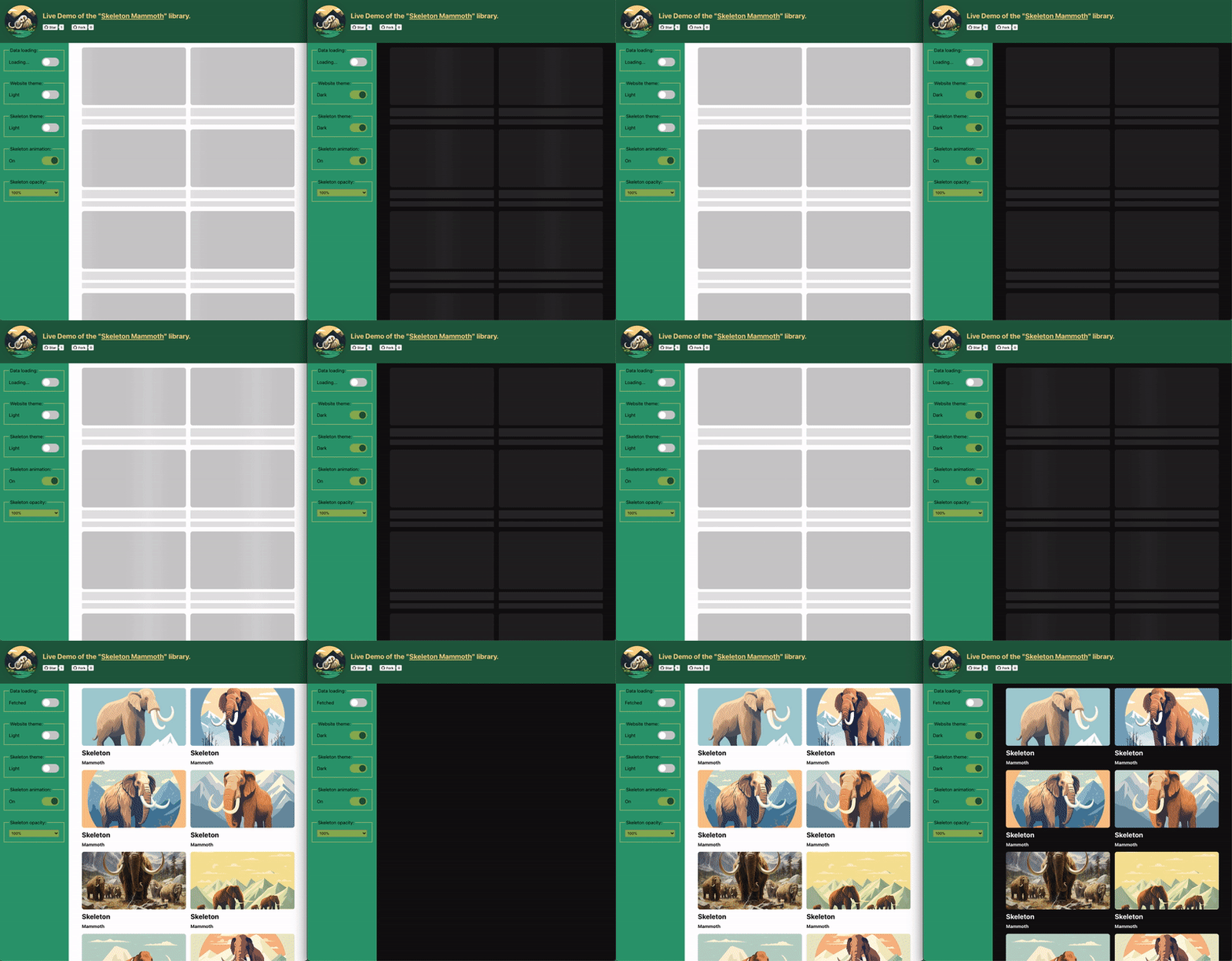
Try out the library in action: Live Demo. The demo lets you change all the settings and see the result. Live demo source code.
| Class | Set to | Description |
|---|---|---|
sm-loading |
the parent element | The switcher: the skeleton is displayed on the child elements while the class is present. |
sm-item-primary |
the element to display the skeleton on | The skeleton with the primary (darker) color. |
sm-item-secondary |
the element to display the skeleton on | The skeleton with the secondary (lighter) color. |
sm-item-lines-N (N is 1...10) |
along with sm-item-primary or -secondary |
The skeleton of a text as N lines. Sets the height of the element to N lines. |
sm-item-lines |
along with sm-item-primary or -secondary |
The skeleton of a text as lines. The number of the lines is taken from the text that the element already has. |
The props of the configuration object (the data-sm-config attribute), see Configuration.
| Name | Values | Default | Description |
|---|---|---|---|
| animation | "none" | "wave" | "wave-reverse" | "pulse" |
"wave" |
The animation of the skeleton. |
| theme | "light" | "dark" | "inherit" |
not set | The color scheme of the skeleton, see Themes and color-scheme. |
| opacity | "0", "0.1", "0.2" ... "0.9", "1" |
not set | The opacity of the skeleton. |
| borderRadius | "0", "1", "2" ... "32", "full" |
not set | The border radius of the skeleton in pixels. |
| reveal | "fade" |
not set | The content appears smoothly when the loading is finished. |
animation
"none": a static skeleton."wave"(default): a light wave runs over the skeleton from left to right."wave-reverse": the same from right to left."pulse": the skeleton smoothly fades in and out.
theme: see Themes and color-scheme.
opacity: applied to the skeleton elements only while loading. Not set means full opacity.
borderRadius
- It is a fallback: it is used only for the elements that do not have their own
border-radius. The own radius of an element always takes precedence, so the skeleton repeats the shape of your elements. Use the prop for the elements that have no radius (for example a text) to make them rounded like the rest of your design. "full"is the maximum radius: a circle for a square element, a pill for a wide one.- For the text lines it is the radius of every bar.
reveal: see Smooth appearance of the content (reveal).
All the variables have the --sm prefix. See Customizing with CSS variables for how to override them.
The source files: variables.
| Variable | Default value | Description |
|---|---|---|
| --sm-color-light-primary | 204, 204, 204, 1 |
The color of the sm-item-primary elements for the light theme. |
| --sm-color-light-secondary | 227, 227, 227, 1 |
The color of the sm-item-secondary elements for the light theme. |
| --sm-color-light-animation-primary | color-mix(in srgb, #fff 15%, rgba(var(--sm-color-light-primary)) 85%) |
The animation (wave) color of the sm-item-primary elements for the light theme. |
| --sm-color-light-animation-secondary | color-mix(in srgb, #fff 15%, rgba(var(--sm-color-light-secondary)) 85%) |
The animation (wave) color of the sm-item-secondary elements for the light theme. |
| --sm-color-dark-primary | 37, 37, 37, 1 |
The color of the sm-item-primary elements for the dark theme. |
| --sm-color-dark-secondary | 41, 41, 41, 1 |
The color of the sm-item-secondary elements for the dark theme. |
| --sm-color-dark-animation-primary | color-mix(in srgb, #fff 2%, rgba(var(--sm-color-dark-primary)) 98%) |
The animation (wave) color of the sm-item-primary elements for the dark theme. |
| --sm-color-dark-animation-secondary | color-mix(in srgb, #fff 2%, rgba(var(--sm-color-dark-secondary)) 98%) |
The animation (wave) color of the sm-item-secondary elements for the dark theme. |
| --sm-color-forced | GrayText |
The color of the skeleton in the high contrast mode. A CSS color (not r, g, b, a). |
| --sm-color-forced-animation | CanvasText |
The animation color of the skeleton in the high contrast mode. A CSS color (not r, g, b, a). |
| Variable | Default value | Description |
|---|---|---|
| --sm-animation-duration | 2s |
The animation-duration: the length of one cycle. |
| --sm-animation-timing-function | linear |
The animation-timing-function: how the animation progresses through a cycle. |
| --sm-animation-delay | 0.2s |
The animation-delay before the animation starts. |
| --sm-animation-iteration-count | infinite |
The animation-iteration-count: how many times the animation is played. |
| --sm-animation-none | none |
The whole animation value of the "none" animation. |
| --sm-animation-wave | --sm-animation-wave var(--sm-animation-duration) var(--sm-animation-timing-function) var(--sm-animation-delay) var(--sm-animation-iteration-count) |
The whole animation value of the "wave" animation: the name of the keyframes and the four variables above. |
| --sm-animation-wave-reverse | --sm-animation-wave-reverse var(--sm-animation-duration) var(--sm-animation-timing-function) var(--sm-animation-delay) var(--sm-animation-iteration-count) |
The whole animation value of the "wave-reverse" animation. |
| --sm-animation-pulse | --sm-animation-pulse var(--sm-animation-duration) var(--sm-animation-timing-function) var(--sm-animation-delay) var(--sm-animation-iteration-count) |
The whole animation value of the "pulse" animation. |
| Variable | Default value | Description |
|---|---|---|
| --sm-reveal-duration | 0.4s |
The transition-duration of the reveal. |
| --sm-reveal-timing-function | ease-out |
The transition-timing-function of the reveal. |
| Variable | Default value | Description |
|---|---|---|
| --sm-lines-gap | 0.4lh |
The empty space between the lines (lh is the height of a line of the element). |
| --sm-lines | not set | The number of the lines. The sm-item-lines-N classes set it, you can set any number in your own CSS. |
Please see the Contributing guideline.
MIT License. For details, please see the License file.
- Found a bug or have an idea? Please open an issue.
- LinkedIn: https://www.linkedin.com/in/aleksandrtkachenko/.