Pixel-sharp React UI for interfaces that need signal, not softness.
16 Bits Design is a themeable, accessible component library built around square geometry, solid surfaces, stepped motion, crisp borders, and deliberate contrast. It ships as one package with no runtime styling dependency.
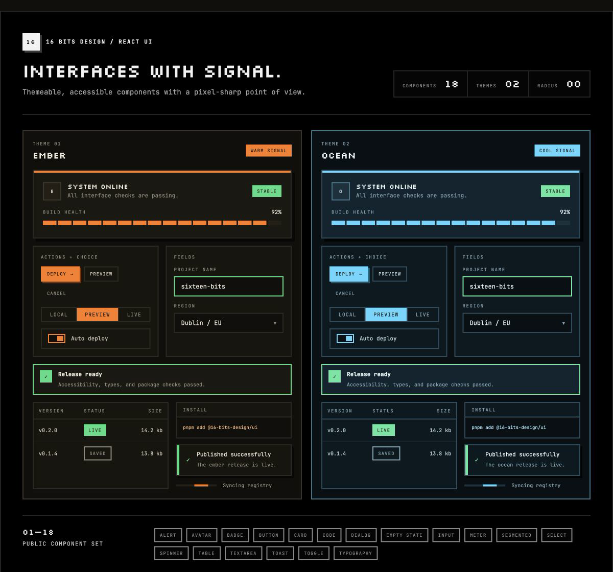
- A complete visual system. Components, semantic tokens, typography, themes, focus treatment, and interaction states are designed together.
- Distinct without decoration overload. Zero-radius controls, 2px borders, offset shadows, and pixel-display headings create character while content stays clear.
- Accessible by default. Semantic HTML, visible keyboard focus, labelled loading states, reduced-motion behavior, and purpose-built dialog and listbox interactions.
- Easy to adopt. One package, one stylesheet, focused ESM/CJS entry points, and TypeScript declarations for every public component.
- Themeable at any scope. Use the built-in Ember and Ocean themes or override
semantic
--bits-*variables with plain CSS.
Install the package:
pnpm add @16-bits-design/uiImport the stylesheet once at your application entry point, then use focused component entry points:
import '@16-bits-design/ui/styles.css';
import { ThemeProvider } from '@16-bits-design/ui/theme';
import { Button } from '@16-bits-design/ui/button';
import { Card, CardContent, CardHeader, CardTitle } from '@16-bits-design/ui/card';

export function App() {
  return (
    <ThemeProvider theme="ocean">
      <Card accent>
        <CardHeader>
          <CardTitle>Ready to deploy</CardTitle>
        </CardHeader>
        <CardContent>
          <Button>Create release</Button>
        </CardContent>
      </Card>
    </ThemeProvider>
  );
}
The root barrel is also available when a consolidated import is clearer:
import { Button, Card, ThemeProvider } from '@16-bits-design/ui';All JavaScript entry points ship as ESM and CommonJS with TypeScript declarations.
| Category | Components |
|---|---|
| Actions | Button |
| Data entry | Input, Textarea, Select, Segmented, Toggle |
| Feedback | Alert, Toast, Dialog, EmptyState, Spinner, Meter |
| Content | Card, Code, Table, Badge, Avatar, Heading, Text |
| System | ThemeProvider, semantic tokens, bundled fonts and styles |
Every component has a focused entry point following the same pattern:
import { Alert } from '@16-bits-design/ui/alert';
import { Input } from '@16-bits-design/ui/input';
import { Table } from '@16-bits-design/ui/table';
The root package and styles.css are available at @16-bits-design/ui and
@16-bits-design/ui/styles.css.
Use block Code for logs, JSON, prompts, and other preformatted machine text. The required label names its keyboard-focusable horizontal scroll region so long lines remain inside the component. Use the inline variant for identifiers and short fragments.
import { Code } from '@16-bits-design/ui/code';

<Code label="Route definition">{JSON.stringify(route, null, 2)}</Code>

<p>Deployment <Code variant="inline">dpl_8f32c1</Code> is ready.</p>Use EmptyState to explain an absence and offer the next useful action. Descriptions stay within a readable measure, the default pixel motif follows the active theme, and headingLevel preserves the surrounding document hierarchy.
import { EmptyState } from '@16-bits-design/ui/empty-state';
import { Button } from '@16-bits-design/ui/button';

<EmptyState
  title="No deployments yet"
  headingLevel={3}
  action={<Button size="sm">Create deployment</Button>}
>
  Create a deployment to connect a repository and start tracking releases.
</EmptyState>Use Spinner for indeterminate waits. Its required label is announced through a polite live region, can remain visible or be visually hidden, and the stepped animation becomes a static bar when reduced motion is requested.
import { Spinner } from '@16-bits-design/ui/spinner';

<Spinner label="Loading deployments" />Use Dialog for focused confirmation or short form workflows. Pass prose through
description so it remains the dialog's accessible description, and pass fields
through children so they render in a block body. size="md" provides room for
forms while the default sm size keeps confirmations compact.
import { Dialog } from '@16-bits-design/ui/dialog';
import { Select } from '@16-bits-design/ui/select';
import { Textarea } from '@16-bits-design/ui/textarea';

<Dialog
  open={open}
  onOpenChange={setOpen}
  title="Run an agent"
  description="Choose an agent and describe the work."
  size="md"
  confirmLabel="Start run"
  confirmDisabled={!agent || !prompt}
  confirmLoading={starting}
  confirmLoadingLabel="Starting run"
  closeOnConfirm={false}
  onConfirm={startRun}
>
  <Select label="Agent" options={agents} value={agent} onValueChange={setAgent} />
  <Textarea label="Prompt" value={prompt} onChange={updatePrompt} />
</Dialog>
The focus trap includes links, buttons, inputs, native selects, textareas,
editable content, and explicitly tabbable elements. An open Select consumes
Escape first; a second Escape closes the dialog.
Use Segmented for a small set of mutually exclusive filters or views that apply immediately. Each option is an individually Tab-reachable button with aria-pressed; the component supports controlled and uncontrolled state.
import { Segmented } from '@16-bits-design/ui/segmented';

<Segmented
  label="Filter deployments by status"
  value={filter}
  onValueChange={setFilter}
  options={[
    { value: 'all', label: 'All' },
    { value: 'running', label: 'Running' },
    { value: 'failed', label: 'Failed' },
  ]}
/>Use Alert for persistent inline feedback that must remain available in the page.
The default variant uses a strong tone border for events that need attention now;
use variant="subtle" for persistent advisory regions such as a danger zone.
Subtle alerts use a compact marker and the quieter role="status", including for
the danger tone. Actions remain explicit composable controls.
import { Alert } from '@16-bits-design/ui/alert';
import { Button } from '@16-bits-design/ui/button';

<Alert
  variant="subtle"
  tone="danger"
  title="Delete this organization"
  action={<Button size="sm" variant="danger">Delete organization</Button>}
>
  Permanently removes the organization and all of its projects.
</Alert>
The derived subtle colors follow the active tone and theme. A theme can provide
exact authored values through --bits-alert-surface and --bits-alert-border
without targeting component classes. Pass icon={null} to omit the marker.
Use the composable table primitives for genuinely tabular data. Table keeps wide content inside a keyboard-focusable horizontal scroll region; give that region a context-specific scrollLabel. End-aligned cells use tabular numerals automatically.
import {
  Table,
  TableBody,
  TableCell,
  TableHead,
  TableHeader,
  TableRow,
} from '@16-bits-design/ui/table';

<Table scrollLabel="Deployment history">
  <TableHead>
    <TableRow>
      <TableHeader>Deployment</TableHeader>
      <TableHeader align="end">Duration</TableHeader>
    </TableRow>
  </TableHead>
  <TableBody>
    <TableRow>
      <TableCell>Gateway API</TableCell>
      <TableCell align="end">02:18</TableCell>
    </TableRow>
  </TableBody>
</Table>The stylesheet bundles Latin JetBrains Mono and Silkscreen font files. CSS custom properties are the theming API; JavaScript configuration is not required. Override variables globally or on any scoped container:
:root {
  --bits-primary: #57d7ff;
  --bits-primary-soft: #a8ecff;
  --bits-primary-shadow: #15576b;
  --bits-surface: #081015;
  --bits-panel: #0c1820;
  --bits-text-dim: #9ab6c2;
}
Built-in themes are ember (the warm, orange original) and ocean (blue/cyan). Apply one with data-bits-theme="ocean" on ordinary HTML, or use ThemeProvider when scoped themes and portalled components are needed.
The public variables cover surfaces, borders, text, semantic colors, shadows and backdrops, typography, font sizes, spacing, border width, and focus rings. Every public variable is prefixed with --bits-.
Use --bits-text-dim for readable subordinate interface text, such as inactive navigation; reserve --bits-text-muted for supporting metadata and placeholders.
The theme's bare-element typography and link rules are low-specificity defaults built
with :where(). A single application class can therefore override them without selector
duplication or !important.
The styling is fully custom CSS built on namespaced classes and CSS custom properties. It has no Tailwind dependency, CSS-in-JS runtime, or consumer build-plugin requirement.
nvm use
pnpm install
pnpm storybook
pnpm check
The workspace is pinned to Node 24.13.1 through .nvmrc and engines. pnpm check runs ESLint, TypeScript, unit tests, the distributable package build, and the static Storybook build.